Choosing a paint color seems simple until you are standing in front of hundreds of nearly identical whites, beiges, and greiges.
Then you bring home the color that looked perfect in the store and discover that it looks yellow in your living room, gray in the hallway, and almost blue after sunset.
Nothing is wrong with the paint.
You are seeing what lighting, architecture, and surrounding materials do to color.
This is especially noticeable in South Florida homes, where large windows, open floor plans, strong natural light, and indoor-outdoor living can make the same color behave very differently throughout the day.
Here is how to choose an interior palette that actually works in your South Florida home.
Start With the House, Not the Paint Fan
One of the most common mistakes homeowners make is choosing a favorite wall color first.
Reverse the process.
Look at the fixed elements that are expensive or impractical to change:
Flooring
Kitchen cabinetry
Countertops
Backsplash
Stone
Bathroom tile
Major furniture
Wood finishes
These materials already contain undertones.
Your wall color needs to work with them.
A beautiful warm white can look dirty next to a cool gray floor. A sophisticated greige can suddenly look pink beside certain beige stone.
The color is not necessarily wrong. The relationship is.
South Florida Natural Light Changes Everything
South Florida homes often have substantial natural light, but not every room receives the same type of light.
A room with strong direct sunlight can tolerate a color differently than a shaded room.
Colors also shift throughout the day.
Morning light, midday sun, afternoon exposure, and artificial evening lighting can reveal different undertones in exactly the same paint.
That is why selecting a color from a phone screen or a one-inch sample is not enough.
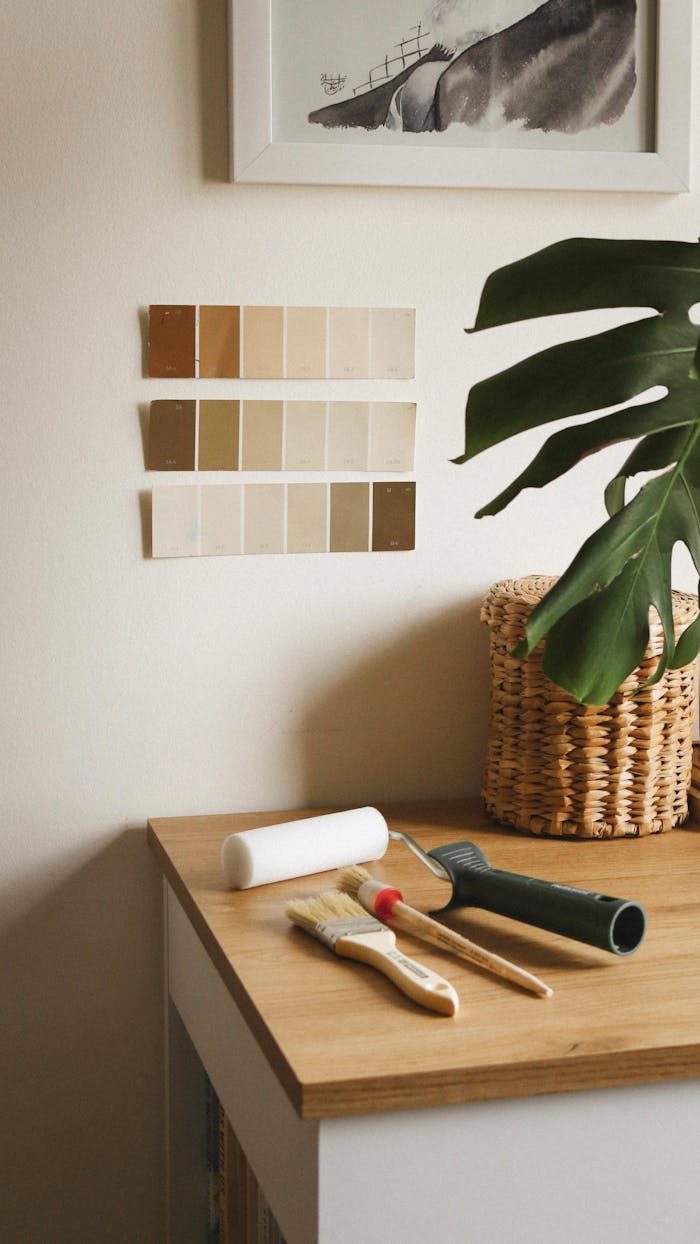
Sample Paint on the Actual Wall
This is one of the simplest ways to avoid an expensive color mistake.
Test your finalists in the room where they will actually be used.
Then look at them:
In the morning
At midday
In late afternoon
At night with your normal lighting
If you are considering a whole-house color, sample it in several locations.
A color that works beautifully in your bright family room may feel completely different in a darker hallway.
White Is Not One Color
White remains popular in South Florida interiors because it creates a clean, bright backdrop and works well with contemporary architecture.
But “white” includes an enormous range of undertones.
Some whites lean:
Warm and creamy
Cool and crisp
Gray
Beige
Green
Pink
The correct white depends on what surrounds it.
A modern home with cool stone and black accents may need a different white from a Mediterranean-inspired home with warm flooring and wood cabinetry.
Do not ask, “What is the best white?”
Ask, “Which white works with this house?”
Warmer Neutrals Are Replacing Cold Gray
For years, cool gray dominated residential interiors.
The market has been shifting toward warmer and more nuanced neutrals: soft greiges, mushroom tones, warm taupes, creamy off-whites, and muted earth-inspired colors.
That works particularly well in South Florida homes because these colors can add warmth without making an interior feel dark or heavy.
The objective is not to chase a trend.
It is to create enough warmth and depth that the house feels intentional rather than sterile.
Consider Soft Contrast Instead of Stark Contrast
A sophisticated room does not need a dramatic accent wall.
One approach that works particularly well in contemporary homes is subtle tonal contrast.
Instead of:
Bright white walls + black feature wall
Consider:
Warm off-white walls + mushroom cabinetry + deeper taupe accents
Or:
Soft neutral walls + muted sage built-ins + warm white trim
The room still has contrast, but the transitions feel quieter and more architectural.
When Dark Colors Work
Dark paint can be exceptional when used deliberately.
Deep navy, charcoal, olive, chocolate, and muted blue-green can add depth to:
Home offices
Powder rooms
Bedrooms
Dining areas
Built-ins
Cabinetry
Interior doors
The mistake is assuming dark paint automatically makes a room feel smaller.
Color perception is more complicated than that.
In some rooms, a deep continuous color can actually create a cohesive, intimate effect because the boundaries become less visually pronounced.
But dark colors require careful coordination with lighting, flooring, and furnishings.
Do Not Ignore the Ceiling
The default answer is usually ceiling white.
It does not always have to be.
A ceiling can be:
A softer version of the wall color
The same color as the walls
A contrasting architectural color
A warmer white coordinated with the room
In South Florida homes with high ceilings, treating the ceiling as part of the design can make a large room feel much more intentional.
This is particularly effective when architectural details, tray ceilings, or molding are present.
Trim Color Matters More Than Most Homeowners Expect
Wall color receives most of the attention, but trim influences how the entire palette reads.
Bright white trim creates stronger contrast.
A softer white creates a more subtle transition.
Using one color family at different strengths can produce a more contemporary, layered look.
Before choosing the trim color, consider:
Doors
Baseboards
Crown molding
Window frames
Cabinetry
Ceiling color
They do not all have to be identical, but they should make sense together.
Paint Sheen Can Change the Appearance of the Color
Color is only half the decision.
Finish matters too.
Common choices include:
Flat or Matte
Provides minimal shine and can create a sophisticated appearance, particularly on ceilings and lower-traffic walls.
Eggshell
A popular wall finish that provides a subtle sheen while remaining relatively understated.
Satin
More reflective and often selected where additional durability or cleanability is desired.
Semi-Gloss
Common for trim, doors, and certain high-use surfaces where greater durability and a more noticeable sheen are appropriate.
The exact finish should be selected based on the room, substrate, and paint manufacturer’s recommendations.
Open Floor Plans Need Color Continuity
Many South Florida homes have open living, dining, and kitchen spaces.
Treating each area as an independent room can create visual fragmentation.
Instead, establish a core palette.
For example:
Main neutral: warm off-white
Secondary neutral: soft greige
Accent: muted olive
Architectural accent: deep charcoal
Trim: coordinated soft white
Individual rooms can still have personality, but they remain connected to the overall home.
Consider the View Outside
This is especially relevant in South Florida.
Many homes overlook pools, canals, lakes, tropical landscaping, courtyards, or lush green spaces.
Those colors become part of the room when you have large windows or sliding doors.
A palette that connects naturally with outdoor greens, blues, stone, and warm organic materials can make indoor and outdoor spaces feel more integrated.
You do not need to paint the walls green because there are palm trees outside.
The connection can be subtle.
Think Beyond Today’s Trend
Paint is relatively easy to change, but repainting an entire home still requires time and money.
If you are painting a large portion of the house, choose a foundational palette you can live with beyond the current design cycle.
Use highly fashionable colors selectively on areas that are easier to update.
A good whole-house palette should work with changing furniture, artwork, and accessories rather than requiring you to redesign the room every time trends change.
A Simple Color-Selection Process
Before committing to a whole-house repaint:
Identify the fixed finishes and their undertones.
Decide whether the home needs a warm, cool, or balanced palette.
Narrow the selection to a small group of colors.
Test them on actual walls.
Observe the samples at different times of day.
Evaluate them next to flooring, cabinetry, and furnishings.
Select trim, ceiling, and sheen after the primary wall colors are established.
This takes more effort than selecting a color online.
It takes far less effort than repainting a house because the undertone was wrong.
The Bottom Line
The best paint color for a South Florida home is not the year’s most popular white, beige, or green.
It is the color that works with your home’s architecture, natural light, fixed finishes, and the way you actually live in the space.
In a well-designed interior, you often do not notice the paint color first.
You notice that the entire room feels right.
Planning an Interior Painting Project in South Florida?
AVVA Painting provides professional interior painting services throughout South Florida.
Whether you are refreshing a few rooms or developing a coordinated palette for your entire home, we can help you evaluate colors, finishes, and the preparation required for a professional result.
Contact AVVA Painting to schedule your free painting estimate.